1st Genre Photoshoot
- jeronimocastano200
- Oct 14, 2024
- 4 min read
Updated: Apr 17, 2025
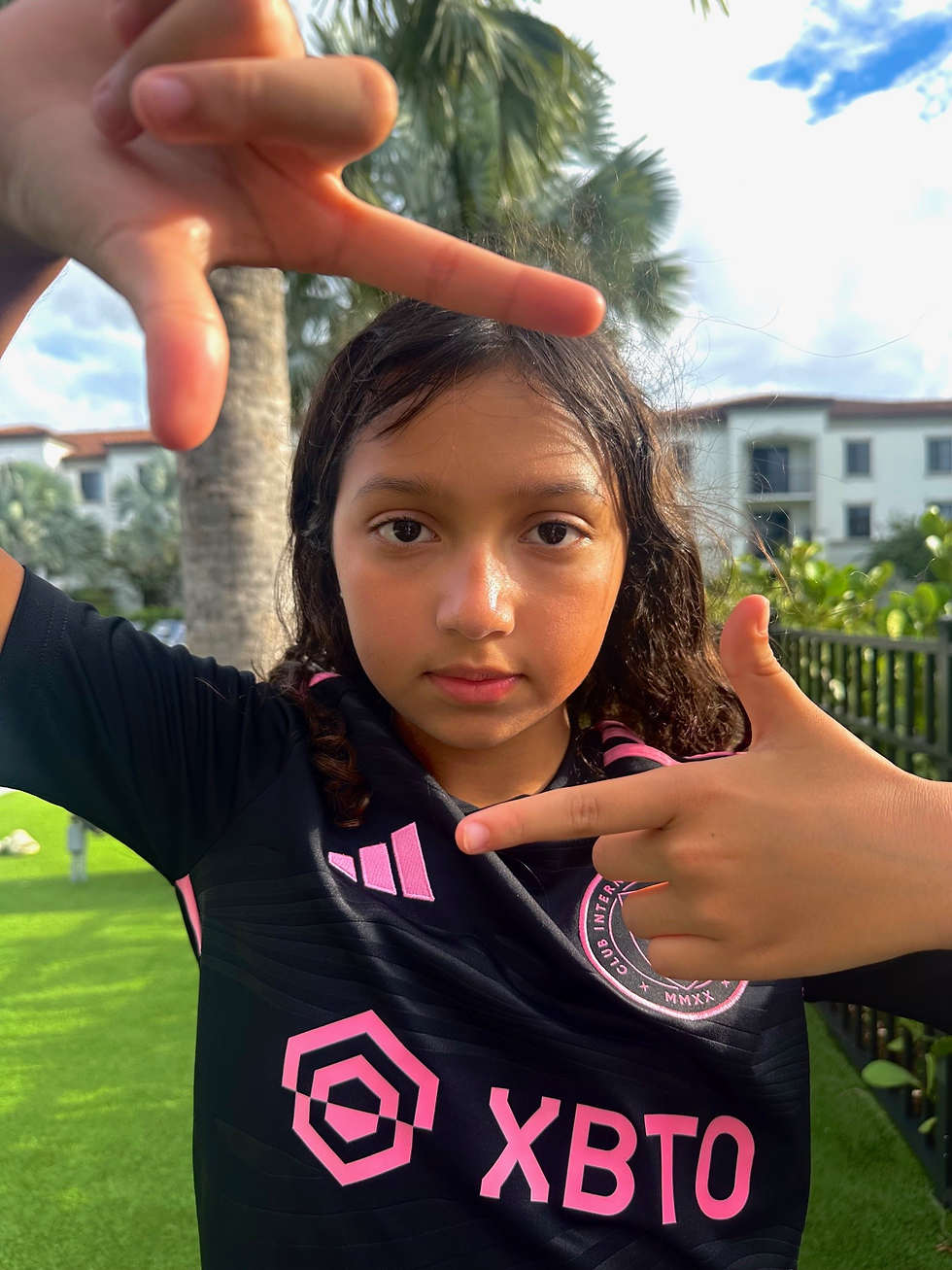
In class we had to choose four genres that we were interested in and for this assignment, limit them down to 2. Out of these 2 genres, we had to decide which one to start with and take 15-20 pictures. I decided to start with the sports genre, more specifically soccer, as it is a sport that really interests me and it was the easiest to do at the time.
Steps to take the pictures:
I had to decide where to take the pictures and what props I would use.
I had to plan out the pictures and the angles / shots.
After I had to choose who is going to be in the pictures and what they will do. (for example the poses and actions)
Then I had to take multiple pictures of the same pose to find the best one
and finally I had to fix the pictures incase they had bad lighting, too much sunlight, or another problem which i can fix before submitting.
My pictures:
Good idea, disappointing result:
- The following 2 pictures I had a great idea but I wasn't really able to accomplish my goal with the picture. For example, the first one was supposed to be my "model" catching the two balls. I had gotten inspiration from another picture I saw online, but it didn't really work due to the fact that, not only does the picture look a bit "sloppy", I also feel that this picture doesn't really capture a lot of creativity. The second picture on the other hand, I feel was a bit more creative, but the soccer cleats do cut out of the picture, which I feel makes it look a little bit worse. However, I do like that the background for the picture is blurry. Including more creativity in my photos was one of the main pieces of feedback I got from my classmates and teacher.


Torn between which is better:
The Following 2 pictures, I really liked the concept and I feel as it was creative and well done. Only thing is, I don't really know which one looks better. The first one I feel like the lighting may be seen as bad at first sight, but the more I looked at the picture, I started liking it more. I feel as if the lighting gives the picture like an aesthetic effect while still making it seem crisp and clean, and also taking away some of the colors. The second picture, I feel like is bland but it keeps more of the colors, such as the face, the jersey logo, and the sky. I got feedback on these pictures, and some of my classmates were also torn between which is better due to the same facts I thought.

My Favorites:
Out of all the pictures I took my favorites are the ones below.


These are my favorites because I feel like they are the most creative, have the best lighting,
and in general are the most aesthetically pleasing. The 1st pic, my actor is looking out into the world, what i specifically like about this one is that the details, for example


in the sky, like the clouds, are really crisp. This acts as a good background, making the picture look better. The second pic Is my #1 favorite because I feel like it is the most creative and outstanding picture. I also did not use the low angle a lot in this photoshoot, so this makes the picture look more unique. The colors in this pic also are really vibrant and they really are the final piece that completes the picture. The 3rd and 4th are both poses that soccer players are seen use often. The third pic is a "skill move" that soccer players use sometimes in games. This picture was definetly the hardest to complete because my "actor" wasn't able to hold the ball in place for a long time, causing me to have to rush the picture before the ball fell. This was the only picture that i made into a canted angle. Finally, the "telephone celebration" is my 4th picture, it is a celebration where a player puts their soccer cleat next to their ear as if they are calling someone. I like this picture a lot since the positioning looks very natural and the lighting is good. This one was definetly one of the pictures that took me the least amount of time, as all i had to do was direct my actor to look a certain way and out the cleats a certain way.
Feedback:
From my classmates and teacher I received the following feedback:
Be more creative with some of your photos
change the background / location, the same one could look boring or bland. (The main one I will consider)
Some pictures could have been framed better. (body parts were cut out from pictures in some)
Even though I wasn't able to get much feedback since I didn't present the project because I was absent. I will take into consideration the limited feedback given to me by my classmates and teachers when I complete future projects.


Comments